Welcome Visitor. First time here? Like what you see? Bookmark us for when you are bored, and check out 'top shots' and 'fantastic (editors choice)' in the menu above, you won't be dissapointed. Join our community! click here to sign up for an account today. Sick of this message? Get rid of it by logging-in here.
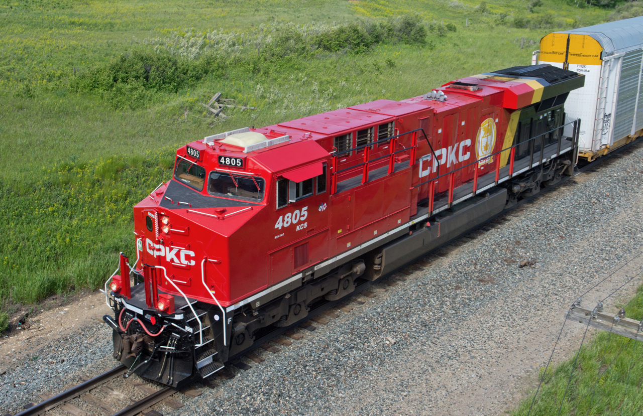


The first KCS unit to be repainted in CPKC colours, KCS 4805 is seen about to duck beneath a sided bridge just east of Mortlach SK.  My thoughts on this new scheme (although completely irrelevant) would be to ditch the gold logo with the white background and just make the letters bigger.  What are your thoughts ?
Copyright Notice: This image ©Matt Watson all rights reserved.


Caption: The first KCS unit to be repainted in CPKC colours, KCS 4805 is seen about to duck beneath a sided bridge just east of Mortlach SK. My thoughts on this new scheme (although completely irrelevant) would be to ditch the gold logo with the white background and just make the letters bigger. What are your thoughts ?

Photographer:
Matt Watson [686] (more) (contact)
Date: 06/08/2024 (search)
Railway: Canadian Pacific Kansas City (search)
Reporting Marks: KCS 4805 (search)
Train Symbol: CPKC# 113 (search)
Subdivision/SNS: CPKC Swift Current Sub (search)
City/Town: Mortlach (search)
Province: Saskatchewan (search)
Share Link: http://www.railpictures.ca/?attachment_id=54557
Click here to Log-in or Register and add your vote.

9 Favourites
Photographers like Gold.Log-in or Register to show appreciation
View count: 537 Views

Share this image on Facebook, Twitter or email using the icons below
Photo ID: 53238

Sorry, there is no map for this photo. Photographer did not add GPS co-ordinates. Please add next time or ask for a correction to this photo.


All comments must be positive in nature and abide by site rules. Anything else may be removed without warning.

4 Comments
  1. I voted for this one. I am part of cpkc history.

  2. Horn cluster on backwards?

  3. I suspect that the logo will get phased out.

  4. Well since you asked… I am opposed to any new scheme but this was the worst of both worlds. The white background ruins an otherwise perfectly good logo and the black on the tail looks like some sick mix of CN and the fictitious AWVR scheme. I feel it represents an American shift to what was Canada’s transcontinental railroad. But I’m just a foamer who can’t change anything so oh well.

Railpictures.ca © 2006-2024 all rights reserved. Photographs are copyright of the photographer and used with permission
Terms and conditions | About us