
Welcome Visitor. First time here? Like what you see? Bookmark us for when you are bored, and check out 'top shots' and 'fantastic (editors choice)' in the menu above, you won't be dissapointed. Join our community!
click here to sign up for an account today. Sick of this message? Get rid of it by
logging-in here.
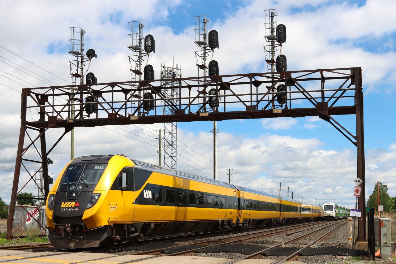

Thats about as action packed as it gets. ) I have always loved that signal bridge.
Old meets new on that signal bridge. Neat to see the new CTC signals on an old bridge that once held ‘searchlights’.
I have always disliked, perhaps even hated, the original VIA paint scheme. It was particularly unattractive when the consist was a mix of the VIA colours and the wonderful CN black and white paint scheme. They hit their low point with the advertising wraps. However, with this paint scheme, VIA has finally surpassed CN.